Living
Cracking The Colour Code
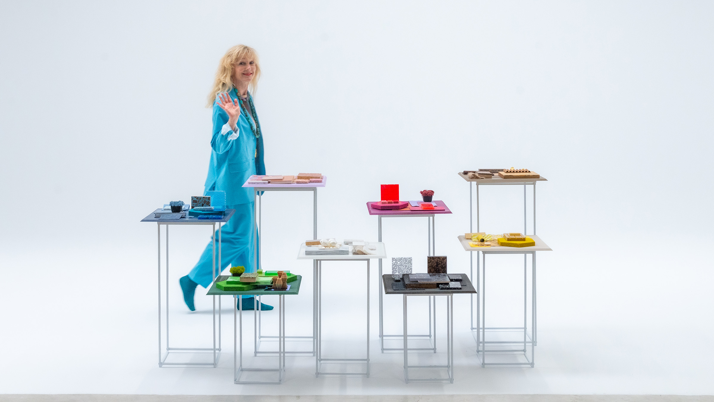
Colour expert and trend forecaster Gudy Herder on the latest in interior design, from what’s in to what’s out and how to use the right hues in every room
When it comes to spotting what’s next in interior design, Gudy Herder – founder of trend-forecasting agency Eclectic Trends – has her finger firmly on the pulse. It’s her job not only to spot shifting attitudes among consumers and the wider culture, but also to help brands stay ahead of the curve and act upon these developments as they emerge. So, who better to talk to about the current state of colour and interior trends, as well as what’s on the horizon?
In this conversation, Gudy reveals her tips for optimising a room with colour, offers her perspective on sustainable design, and shares the trends that caught her eye at the recent Milan Design Week – and which may be set to redefine home aesthetics.
Amex Essentials: You’ve built a reputation for staying ahead of trends in interior design. How do you manage to spot trends before they become mainstream, and what tools or strategies do you use to keep up with the latest in the design world?
Gudy Herder: A trend does not appear randomly; it usually evolves from something that has already been “cooking” in the market. We closely monitor emerging patterns we’ve identified and track how they evolve over time.
Our insights come from a wide range of sources: visiting trade shows, interviewing tastemakers, serving on competition juries, conducting desk research, attending conferences, reviewing market studies on consumer behaviour. It’s always a blend of online and offline information, but in my experience, travelling and engaging remain the most powerful sources of information. Nothing beats a conversation in real life.
Could you briefly explain your process for forecasting colour trends?
Colour forecasting usually begins with identifying the broader trend first. For example, if we’re exploring the nuances of the wellbeing trend – that is, its emotions, values and societal impact – we translate those insights into a corresponding colour palette.
Sometimes, we notice a specific colour emerging organically in various contexts. In those cases, we work backwards: we ask why this colour is resonating now, and which overarching trend it aligns with. This blend of intuition and analysis helps ensure our colour predictions are both meaningful and relevant. In short, sometimes the research comes first; other times, it’s a specific colour.

Colour plays a significant role in how a space feels or functions. How would you suggest people use colour to optimise different rooms?
Broadly speaking, rooms are often associated with a certain function and emotion. The key is to find which colours best support those characteristics. While colour psychology offers useful guidelines, each person may also experience and respond to colour in a more intuitive way. What’s important to remember is that we’re constantly evolving, our needs change, and so do the colours that resonate with us.
For bedrooms, this is a place for rest and recovery, so calming or romantic tones work best. Think: blues, warm neutrals, or a soft pink. I would avoid overly bright or stimulating colours here.
Regarding the kitchen, this is often the heart of the home, and every family uses it differently. It can be a place for connection and conscious food consumption, often related with natural tones, like terracotta or sage green. But brighter accents can also add a sense of freshness and vitality, if you feel it’s the vibrant heart of the home. This is probably the room that depends most on personality.
For home offices, colour should support focus and serenity. Clean tones like dusty blue or neutrals can encourage mental clarity. Adding a touch of green can also help reduce eye strain and connect the space with nature. Vibrant colour accents in corporate environments foster creativity and work really well, too.
However, the use of colour shouldn’t be confined to strict rules. Instead, it should reflect who we are and how we feel in a given moment. It’s always a very personal choice. I believe less in guidelines and more in experimenting.

We know trends come and go, but not everyone has the time or budget to completely redecorate each season. How can people incorporate current trends without overhauling their space?
Let’s look into what a trend is. I’d like to challenge the overuse – and often superficial interpretation – of the word ‘trend’. A trend isn’t just about what’s popular – it’s a reflection of deeper human needs and values. A trend in my industry is very different to a trend in the fashion industry. Even choosing not to follow what’s considered ‘trendy’ – resisting fast-changing market influences – is, in itself, a kind of trend. It’s a reaction to the pace of consumer culture, and often a more sustainable one.
Take the return to vintage, for example. It’s a strong direction now, not just for aesthetic reasons, but because it offers a sense of emotional connection and comfort in uncertain times. It’s about nostalgia, authenticity and creating a sense of home that feels meaningful. So rather than chasing surface-level updates, people can weave in elements that resonate with the current emotional climate – a colour, a texture, a meaningful object – without overhauling their entire space.
As a trends expert, you’re constantly watching what’s in and what’s out. What’s one design element you believe is being overused right now, and what do you feel deserves more attention?
I don’t really think in terms of what’s ‘in’ or ‘out’ — that mindset often comes from fashion cycles and glossy magazines, and while it has its rightful place, it’s not how I like to approach design. Instead, I observe signals — how they emerge, evolve, and sometimes gain enough momentum to be embraced by a wider audience. These signals can become trends and eventually go mainstream.
Right now, I believe ‘soft minimalism’ is at its peak. It’s not going away anytime soon, but we’re already seeing a shift, a desire for more individuality and bolder expression in our living spaces. The classic creamy, off-white palette with many layers of textures is being saturated. The arrival of brutalist influences is in full swing: broken edges, colder metals and more sculptural forms, and elements that add tension and contrast as a response to how we feel now. It’s a great example of how we relate to trends based on our emotions.

[Image on the left: © Joanna Noguera Photography]
How have you seen people’s overall approach to interior design change in the past few years?
The concept of what a home is shifted almost overnight during the pandemic. Our top priorities became comfort, safety, and functionality. Spaces needed to support work, relaxation and everything in between. Many leaned into oasis-like interiors: spa-inspired, cocooning environments that felt nurturing and calm.
There’s a growing desire for more individuality and character, as I mentioned briefly before, too. People are becoming less concerned with whether everything matches and are more interested in how a space feels and what it expresses about them. It’s less about harmony, more about personality, even a touch of edginess. We will integrate small furniture with a rougher surface, unpolished edges, vintage pieces with a story to tell, travel items from other cultures that will not blend in but stand out. I’m not saying we’re all becoming eclectic, but we’re defending our own style more.
Sustainability has become an important topic in interior design. How are eco-friendly choices influencing trends in the design world?
Eco-friendly choices in interior design are still strongly associated with earth and green tones. While I’ve been advocating for a broader colour range to appeal to a wider audience, I understand the importance of maintaining coherence by using natural pigments. Not all natural pigments are stable, which poses a challenge. However, ongoing research is promising, and I’m hopeful that we’ll soon see a more diverse and vibrant palette available in bio-based materials.
I currently do a lot of work in neo-materiality, focusing on sustainable and innovative materials. This has become a major part of my practice, especially through collaborations with interior designers, architects and multinational brands, working on two key themes. The ‘green’ theme reflects the growing trend toward bio-based materials like bark, rose petals, grass composites, cork and veneer. These are ideal for interior and product design, drawing inspiration from nature and supporting a more sustainable approach. In the ‘monochromatic’ theme, minimalism meets industrial and brutalist aesthetics, where metals take centre stage as the go-to material for confident, curated interiors that highlight personality.

You attended the recent Milan Design Week. Were there any surprising materials or colour combinations that stood out to you?
Copper seems to be making a quiet comeback – just a few early signals so far. But it makes sense: as we enter an era dominated by white metals and their colder appearance, copper offers a warmer counterpoint. It’s still too early to say, but it feels like a natural evolution. Glass continues to be big, as it was last year. All things translucent are still trending. What stood out this time was how often glass was combined with other materials, such as metal or wood, rather than being the sole focus.
In terms of colour, a new tone emerged in product design: buttercream. Brands like Tacchini and Zanotta embraced this soft, subtle yellow. After several years of bold, vibrant yellows, this feels like a refreshing and more nuanced shift.
What overarching trends caught your attention most?
I noticed that while each brand explored its own unique theme, there was a noticeable absence of overarching narratives like sustainability or wellbeing – topics that had been much more prominent in past editions. Social design and meaningful engagement were more often seen in smaller studios or student projects, whereas the larger, multinational brands seemed less focused on delivering strong, purpose-driven messages.
Of course, there were exceptions, but overall, it felt like there might be a growing disconnect between major industry players and the broader, urgent conversations shaping society today. It’s something we’ll need to observe closely in the coming years – whether this reflects a temporary shift or a deeper, more structural change in how design engages with critical global issues.
Learn more about Gudy’s work and services on Eclectic Trends, and follow her on Instagram for quick design insights. You can subscribe to her newsletter to get exclusive access to her personal reflections, trend news and curated resources.
[Image at the top: © Joanna Noguera Photography]


Sorry, the comment form is closed at this time.